Saturday, December 1, 2012
Entry 67
Friday I went to see the Clemson Player's production of Boom. A comedy about the end of the world. It was a really funny experience and the play was quite inventive. The play took place in a single room with multiple artificial lights and the character's were constantly using them. So there were several scenes where a character had to turn on a light, or scenes where the room was plunged into darkness due to a power failure and the characters had to use flashlights. While the light in the scenes were quite realistic I noticed that several scenes had more light than a truly realistic scene would. For example, after the blackout an emergency generator was used to power some hanging lights, and after a couple of minutes several other lights were gradually added to enhance the visibility.
Tuesday, November 27, 2012
Entry 66


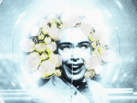
Snapshots of Darren Aronofsky's The Fountain
image taken from: http://mithrasblog.wordpress.com/2008/12/28/the-fountain/
Darren Aronofsky is an truly visual storyteller and director. Each of his films has a stunning and well developed look and feel. The film of his that I found the most aesthetically pleasing was The Fountain. A story of life. love, loss, and rebirth, The Fountain is nothing if not beautiful and each moment in the movie is filled with this golden unearthly light. In some scenes, such as the astronauts journey through the stars, this light is purely abstract and symbolic. The scene is meant to be dreamlike and almost surreal so the light while beautiful isn't something we would ever really get a chance to experience. However, this golden glow appears in more realistic scenes as well such as in the second picture where a scientist and his wife visit a museum. The light scheme reflects the principles of magical realism, an artistic movement bent on revealing the magical beauty in the mundane and ordinary. The lights in this scene have the same golden unearthly vibe as the lights in the top picture, but they're grounded far more in reality. These simple museum lights have been enhanced to really stress just how heavenly the love between these two people is and just how special the bond they share has become.
Entry 65

Snapshot of Disney's The Lion King, Broadway Musical
When I was young a group of friends and I went to see this musical in Boston. I remember being blown away by the costumes but looking back at the production there is a great deal of beautiful lighting in the musical as well. I brought up this picture because I was struck at how the lighting designer chose to handle the task of lighting the actors with these elaborate masks. In order to make such the audience focuses on the animal masks and sees those as the heads of the characters and not the actors' faces, the designers chose to aim these bright spotlights onto the masks and leave the rest of the actors' faces and bodies to be revealed by the fill-lights. It was a simple thing but it makes a huge impact.
Sunday, November 25, 2012
Entry 64
Jillian Mayer's Scenic Jogging
Go Here for Video:
Scenic Jogging by Jillian Mayer is a video which features a lone woman running down the empty sidewalk of an urban street at night with a projection of a green field shown on the buildings behind her. Its quite an interesting sight to see this woman run down the streetlight lit road and see the difference in lighting when the projection has a wall or hard surface to hit and when an empty lot or street intersection denies the projection a surface. I wonder if you could have a play where an image was being projected but there was no surface for the projection to appear on and then during the climax a wall appeared and the projection became visible.
Entry 63
I was walking down a street with several buildings and noticed that the lights from each building, and the lights from the cars and lamps, and the light from the sunset all seemed to exist in a certain area of space. In a similar sense that I could break down each object into a certain shape or color there was a certain type of light unique to each object. I think in my mind I expected these lights to mix or be overpowered by one major light source. While there was no definite edge to the objects light they still had a certain degree of separation from them. I bet in the same way some artist use only color or shapes to create an environment an artist could use different types of light.
Entry 62

image taken from: http://whitney.org/Exhibitions/GlennLigon/Images
This next picture is to examine the use of positive and negative space in light. Human's will always perceive darker colors as being behind or farther away from lighter colors.This picture Hands is a perfect example of this the only indications of depth present are the use of light in shadow, and of overlapping. The sizes of the hands don't vary that much so size isn't really an indicator. Light is used to reveal depth here by creating a background of darkness and a foreground of white lit hands. Oddly enough the degree of light an object receives is not related to how close of far away from us. the closest hands have varying degrees of light and the small faraway hands are both brightly lit and covered in shadow. Still the presence of the light allows use to see the details of the hands and to help with our perception of depth this means that closer objects have more details and objects that are further away have less.
Sunday, November 11, 2012
Entry 61

image taken from: http://lsimpsonstudio.com/photographicworks07.html
Lorna Simpson's Necklines is a great example of how to use contrast to reveal the subtle contours and curves of the human body. The light raps around the figure revealing peaks and casting even the smallest crevice into shadow. You can clearly see the slope of the neck and the dimples created by the collar bone. I especially love the middle image which beautifully exposes lips of the figure using the light to pull them away from the chin. The extra touch of the white shirt to contrast the dark background is also quite inspiring.
Entry 60
TM Sisters' In a Matter of Speaking
Go Here for Video:
I wanted to try and find a video to talk about movement. Since, most of the images I look to for influence are well images I thought it would be a nice change of pace to look at a video. TM Sisters' In a Matter of Speaking is a seizure inducing splash of various images. The whole thing is super vibrant and the whole thing looks like a role of film burning up in a projector at certain points. However, there are small moments where the light is desaturated and a few scenes even contain darker looks like a sunset. While this clip may seem like a haphazard collection of blinking images there is a good deal a lighting director can learn from it. Mainly that the audience needs moments to rest. The bright flashes maintain there jarring effect by including inbetween low intense moments. Also, it doesn't matter how crazy a light's movement is if a bright spotlight is being shined in your face that is the first thing you will notice even if that bright light isn't moving a great deal.
Entry 59

image taken from: http://davidcastillogallery.com/xaviera-simmons-american-book-covers/
I wanted to talk about this picture and the works of Xaviera Simmons in general because after looking at picture after picture of emotionally manipulated lighting compositions I found it rather striking to find a picture with such "natural" light. Now, I used quotes because I don't mean that this is the only piece I've seen in such a long time that used light from the actual environment. I mean that this piece simply uses light to make the character visible and tell the time of day. The light here doesn't tell us anything about the narrative the artist is trying to convey. You can tell the scene is taking place sometime during the spring or summer during a clear sunny day but that is all. The person in this piece could be feeling any number of emotions and the story could be a comedy or tragedy the light alone doesn't tell us that. But, even this in-fact does tell us something about the photo. The artist chose to stage this shot during this time of day, she chose to shoot in this location during this season. Did she want the audience to only focus on the actions of the figure not the mood of the scene that surrounded her? Was she striving for a truly realistic shot to fool us into thinking this was a real scene not a staged photograph? Did she mean for the light to have a feel, to be welcoming and bright, and for that feeling to be in contrast with the figure inside that environment? When can a lack of a discernible mood be used by a designer to enforce a mood or style?
Entry 58
Recently I was able to aid in the lighting set up for the play Ensemble. It was an enjoyable experience working with the lighting fixtures and trying new hanging arrangements. But, while I was busy hanging those lights I noticed there were a lot of things I noticed about how the lights interacted with each other that I just couldn't really explain. Like how a light will look one color when it is by itself but when another light is present that color seems to change. The relationship between intensity and color is something I've written about almost every other post but really what is the deal. I wish I knew a little more about the science of light and how it works; like why the shape and angle of objects change when passing through a transparent surface like water or glass. Or just how far you could go in either infrared or ultra-violet light. Like how if you get something cold enough it feels like a burn, can you have a light so ultra-violet it behaves like an infrared. Mostly, the whole experience of hanging lights, observing light, and pondering about lights made me wonder if I have run out of things to say. Just how much can a person write about their uninformed observations of lights before they have to start doing calculations and experiments to learn more.
Entry 57
.jpg)
Rashid Johnson's Cosmic Topology
image taken from: http://www.davidkordanskygallery.com/?aid=20&n=artists
Rashid Johnson's work perfectly illustrates how the object being lit is just as important a factor to consider in lighting as the lights used in the scene. Certain areas of this piece, Cosmic Topology, really stand out due to their brightness, but the light on the piece is fairly uniform. The golden spray paint reflects the light in such a way that we see more light coming from those areas than any other. This is obviously due to the simple nature of reflections and such but I bring it up because it again shows what you can do when you use the item being lighted in your lighting design. The light shown on this object is white; yet, thanks to the reflective color of the metal we see yellow light. With a single white light and five highly reflective yellow spots the whole lighting look is changed from white to yellow.
Sunday, November 4, 2012
Entry 56
I've noticed that when a room has one light on and other light off I can see the differences in the amount of light present in the two areas when I look at a wall. The wall not illuminated by the first light is dark and there is a distinct edge/area where the rays of the light reach. However, without the wall I can't tell where the light ends it just gradually gets darker, there is no place on the floor like there is on the wall.
Entry 55
The Drawer Boy Reference Images:
Here are some images I would reference if I was tasked with creating the lighting design for The Drawer Boy, a play by Michael Healey.Outside: Early Morning/Dawn


Outside: Mid-Day/Afternoon


Outside: Evening/Midnight


Inside: Mid-Day/Afternoon


Inside: Evening/Dinner


Mood: Angus' Delusions/Sad Memories


Thursday, November 1, 2012
Entry 54


(L-to-R) Barkley L. Hendricks' Tuff Tony, Icon for Fifi, and Tequila
images taken from: http://nasher.duke.edu/galleries/main_gallery/?cat=1&offset=0&pic_id=1
This comparison is really more of an illustration of a point. When lighting figures who are wearing similar colors to the colors of the sources a designer always has to be aware of possible washing out. If the objects and the lights colors are too similar the figures can fade into the background and the whole scene can appear flat. Barkley L. Hendricks; however, seems to prefer scenes where the colors of his figures reflect the colors of the background and has some great solutions to any fading affects. First, off he uses contrasts in saturation and vibrancy, all of the backgrounds in these three pieces are much softer and much more tinted then the figures. Tequila features a light pink background and though the mixture of red and white on the woman's clothes reads overall as pinkish to the viewer, the woman's form is still fully realized thanks to the sheer vibrancy of the red and white. The same is true of Icon for Fifi which features a woman in a highly reflective satin yellow jumper against a more brownish and muted backdrop. For Tuff Tony it appears as if Barkley L. Hendricks added some light blues to the white of his background in order to make the man's white clothes seem that much more pure in comparison.
Tuesday, October 30, 2012
Entry 53
I was looking at the reflective part of a television and notice that the colors of the items it reflected were incredibly close to the original. At first I even thought they were no different from a mirror then I looked blacked and noticed the very obvious difference between the two. The black TV's reflection were noticeably darker, but my mind really wasn't reading them as such until I compared them to the original item. Is this an example of color fatigue? Had my mind instinctively read the dark colors as neutral? I wonder how those reflections would compare to ones from a highly reflective white, or red surface. Could those surfaces even be able to reflect objects?
Entry 52

image taken from: http://www.leonardodrew.com/drew%20site-Pages/Image31.html
Leonardo is an instillation artist whom has chosen to add human subjects to his composition. Whether he designed the lighting himself or with the aid of another lighting designer, the piece Number 47 is a wonderful example of a unique use of contrast. Contrast with light is often about either the differences in a harsh bold light and the hard bold shadows it creates, or it is about the contrasting colors of the lights. This scene is a mix of the two the sharp contrast is created by the bright yellow light and the dark black areas it is unable to illuminate. Non of the actors on stage cast dark shadows, but their black clothing does reflect of the stages surface to ground the actors in a similar fashion to the shadow. The light in the background creates contrast by illuminating a section of highly reflective objects and keeping the other areas of the stage cast in darkness. This helps the illuminated wall of items push out and create a background, middle-ground, and foreground.
Monday, October 29, 2012
Entry 51

image taken from: http://www.pbs.org/art21/images/kimsooja/to-breathe%E2%80%94a-mirror-woman-2006?slideshow=1
Mirrors are amazing. I kept trying to write about this photo and for the longest time was never able to really say what I love about it. I think it all begins with just how efficient the artist uses the light and reflections. Looking at the sky you can see the scene atmosphere is rather overcast. There certainly isn't any sun. But despite this the whole area is fully illuminated with little to no shadows. Visibility doesn't always require an extra source of light, just a smart designer.
Friday, October 5, 2012
Entry 50

image taken from: http://www.pbs.org/art21/images/janine-antoni/saddle-2000?slideshow=1
"I think the startling thing for me was that I made a ghost of myself.
When I’m with the piece I feel the absence, both of my body and the cow.
It wasn’t necessarily something I intended for the piece, to be so
ghostlike. It’s transparent...there’s nothing underneath, although the
shape so articulates the figure. It’s a kind of push-pull that you feel,
of such a presence of the figure. For me, the shocking thing was to
realize that I’ve made a piece about the death of the cow, my own
death."
- Janine Antoni
- Janine Antoni
I often write about how light helps us place an object in a scene or how it helps give an object or scene a style and mood. Janine Antoni's Saddle is a perfect example of how light helps us tell how thick and object is and how much weight it has. Despite depicting a crouching full grown-human being this piece feels incredibly light, even without knowing what material it is made out of, the sculpture appears as though it could easily be toppled. This is because, as Antoni states, we can perceive the absence of a body due to the material's transparency. The light pacing through the object tells us that there isn't anything underneath the cloth, it is the light which gives Saddle its ghostlike appearance.
Tuesday, October 2, 2012
Entry 49
Ellen Gallagher's "Monster", from the suite of five 16mm films, "Murmur"
image taken from: http://www.pbs.org/art21/images/ellen-gallagher/monster-from-the-suite-of-five-16mm-films-murmur-2003?slideshow=1
I'm not sure what the theme of the suite of five 16mm films this piece was from were about but I'm guessing they were out of this world. "Monster", from the suite of five 16mm films, "Murmur" is a really bizarre piece that seems to have turned a human being into a living lightbulb. This creation is so special as it's an oddity you just don't see, an object that is reflecting and giving off its own light. The face still has shadows and has been dyed blue by the light in the environment and yet there is a strange halo of yellow bulbs emitting rays of pure white light in several directions. The whole piece in incredibly bright but it's still able to create contrast by using monotone shades blue and really darkening the shadows on the face.
Entry 48
So last week I got to sit in on The 25th Annual Putnam County Spelling Bee technical rehearsal. I was there to observe how a lighting designer and director work during an actual production. The cast and crew were all present and they would run through scenes over and over again. There were already plenty of lights hung in place and the overall look of the show seemed complete. The rehearsal was mainly a way for the actors and various directors to see what a the final production would look and feel like. So, you had actors learning where to stand and how to move in order to remain properly illuminated a the lighting designer making small adjustments to really capture the look they wanted. Often the actors would have to completely change their stage directions and actions and the director and designer used the time to try out new tricks.
Sunday, September 30, 2012
Entry 47

image taken from: http://www.pbs.org/art21/images/maya-lin/untitled-topographic-landscape-1997?slideshow=1
While lighting from directly above is not advised for illuminating humans, Maya Lin's Untitled (Topographic Landscape) is a nice reminder that it can be a great choice for other structures. The top illumination of this piece highlights the peeks and dips of the land and focuses our attention on the very center peek. If I saw this type of light in a film it would be used to reveal the overall setting of the story and then zoom into the center of action. I love how the artists uses the alternating sizes of the the ridges in the landscape to help shape the piece by creating contrasts with shadows and how that gives the overall work a sense of life. Like waves on the ocean or rolling fields of barley.
Wednesday, September 26, 2012
Entry 46

Jenny Holzer's Krakow
image taken from: http://www.jennyholzer.com/Projections/site/Krakow2011/#
Jenny Holzer is a modern artist who works with Projections, superimposing images in phrases onto landscapes using high intensity light. What's truly amazing about her work, as seen in this projection Krakow, is how well she matches her lights to the lights of the environment. This black and white photograph shows the intensity and tones of her projection in comparison with the natural city lights in the background. The two are almost indistiguishable, which makes the projection feel as if it is apart of the landscape. While it's obvious the words aren't coming from a building like the other lights in the scene, it still feels like the words are apart of the city as if they are the words of the city.
Tuesday, September 25, 2012
Entry 45

Disney's Aladdin, Poster
image taken from: http://en.wikipedia.org/wiki/File:Aladdinposter.jpg
Talking about Disney again and it's another poster too, for Disney's 1992 film Aladdin. What I really love about this poster is that the artist is trying to replicate a light source they would never be able to actually observe. The light emitting from the lamp seems to be comprised of hundreds of stars and comet trails. It reminds you of the stars in the sky but when you actually look at those stars you'll notice they produce light which is nothing like the light in this poster. The designer of this poster chose to enhance the starlight by making it function more like a lightbulb. It's a combination of several different kinds of actual light sources resulting in an entirely new one. When creating light for scenes it appears that one should root themselves in observation and then let their imagination soar.
Monday, September 24, 2012
Entry 44
The use of color theory in various environments has been a well researched subject. People know that hospitals and rest-homes use blue and green paints to instill a peaceful and trustworthy atmosphere for their patients and that people often use light colored paints in small rooms rather than darker colors in order to make the rooms feel larger. People use colors in all sorts of ways to affect how people feel when they enter an environment and most people know a little bit of how this works. But, how is light used. I noticed that a lot of institutions like schools and hospitals have the same high intensity bright blue light in their hallways. Also, just as how white paint can keep a room from feeling cluttered the inclusion of a sunroof and natural light can really widen out a space. I wonder how do architects chose to light a structure and what are the reason's behind their designs.
Sunday, September 23, 2012
Entry 43
I was fiddling around with a Lee filters sample book and wanted to see how the reflectors (ie the L270, L271, and L273) worked. I grabbed a flashlight and lit up a finger with a lee reflector swatch on the other site so it could catch and reflect the flashlight's beam onto the other side of the finger which was not struck by the light. L270 was a metallic silver sheet full of holes and the light it reflected looked as though it had passed through a cheese grater. L271 was completely flat yet it also reflected a holey looking light when I though it would reflect an even light. When I looked at it closer I noticed that the smooth sheen was actually full of small groves and only looked flat. Then I reflected light off L273 which was a full of groves like 271, but these groves were much bigger, like crumpled up tinfoil. Oddly enough it was this sample which reflected the smoothest light.
Entry 42

image taken from: http://en.wikipedia.org/wiki/File:Vincent_Van_Gogh_0013.jpg
I feel like I keep talking about two things in the blog, color and shadows. I don't know why I fixate on these two aspects of light. Maybe it's because they are the first things we notice about a scene, maybe it's because as an artist color and shadows are my bread and butter, or maybe it's because as a novice lighting designer they are the only aspects of light I can really talk about since they are so easy to examine. Still I am always surprised by just how much a single shadow can do. Take Vincent van Gogh's Painter on His Way to Work, there is only one shadow in this piece and yet the work still rings true. In a realistic environment the sun would be casting shadows of the trees at the very least and maybe even a bit of the wheat in the background. There is a surprising lack of shadow in the painting and yet it still took me a moment to realize this, for quite a while a single shadow was all I needed for this scene to feel truthful.
Saturday, September 22, 2012
Entry 41


Picture of Oprah Winfrey
images taken from: http://en.wikipedia.org/wiki/File:Oprahfirst.jpg
So for this comparison I'll be looking at a random image and a copy of the same image but with some of my own manipulations so that I can try some lighting design of my own. So here we have two images of Oprah Winfrey the one on the left is the original and the one on the right is the image with the level of orange ramped up to represent lighting the scene through an orange filter. Orange filters block out blue light so the multicolored background becomes almost completely one shade, though the corners do seem a little green. Also the grey and yellow cloths of the two people in the lower right corner become practically the same color. So under an orange filter blues, greys, and yellows all turn to orange. The only color that is really enhanced by the orange filter is the reds in Oprah's shirt. This would be very helpful if I were designing a scene where I needed one person to stand out and the costumes in the scene were a mix of blues greys and yellows.
Entry 40

image taken from: http://en.wikipedia.org/wiki/File:Palacio_de_Bellas_Artes_-_Mural_El_Hombre_in_cruce_de_caminos_Rivera_4.jpg
Diego Rivera's Man, Controller of the Universe showcases mankind's godlike abilities to create and destroy. While the mural does have very interesting use of light within it, in the highlights it uses and contrasts in high and low saturation to stress the difference between good and evil, it also uses the light of the environment it is displayed in very well. As a muralist Rivera must paint with his environment in mind since his work will be there permanently. If for example, he was hired to paint a mural for a dark dull hallway and he created a mural that uses dark colors , his creation not matter how beautiful would suffer. Unless Diego's mural was meant to be seen in a dark environment the mural wouldn't work and the patron would either have to pay to install lights or chose to mot pay Rivera. When creating a design there may be some lighting conditions that the designer has no control over and its best for the designer to work with these conditions to enhance their work. Rivera uses the bright ceiling lights of this building to further illuminate the bright shining "golden era" of man kind and to help create further contrast between it and man's darker creations.
Friday, September 21, 2012
Entry 39
When light is shining though a blind the closer the surface it hits the clearer the blind shadows are. When shining on a table there are clear light and dark patterns but when the light has to travel all the way to the floor the shadows blur. The distance the light has to travel affects the type of shadows it produces. Is there a particular reason for this? I've notice that in the theater despite the criss-crossing wires the only things that cast shadows are the much larger beams. Why is the light able to fill in shadowed spaces as it travels further from its source?
Entry 38

Snapshot of Louise Lecavalier's A Few Minutes of Lock, Staged at Jacob's Pillow
Nothing says "THIS IS A STAGE" quite as clearly as a row of footlights. While many lighting try an emulate realistic lighting conditions or try and capture a specific mood, visible flood lights tend to do both. There's this endless mobius loop with footlights, they make a scene feel like it's on stage but the scene is already on stage so they aren't needed, but without them the scene doesn't feel like its on stage so they are used to make a scene feel like it's on stage. Without the footlights, Louise Lecavalier's A Few Minutes of Lock could take place anywhere. They create a location all by themselves. I wonder what other lights do this.
Tuesday, September 18, 2012
Entry 37

Ann Hamilton's Suite of 12 Iris prints on Arches watercolor paper
image taken from: http://www.annhamiltonstudio.com/prints/reflections.html
Working alongside photographer Aaron Igler, Suite of 12 Iris prints on Arches watercolor paper is a repetition of artist Ann Hamilton behind a layer of glass throughout several periods of the day noting the changes in light and weather patterns. This piece is a wonderful illustration of how changes in a light source affects the visibility of an object. Not only do the changes in light reveal different aspects of the figure behind the glass but they also reveal different details about the glass itself. Oddly, enough this print also shows us that more light doesn't always equal more visibility as the brighter pictures completely wash out the artist's face but the darker pictures really reveal the contours.
Entry 36
On rainy days there aren't any shadows on the pavement. Instead you get reflections of the objects and unlike the direction of the shadows, which are based on the location of a light source, the direction of the reflections are based on the location of the person viewing them. For example, if a person is walking between a car and a lamppost on a sunny day with the sun on the left the shadows of all three objects will be on each object's right. However, on a rainy day the reflections of the car and lamppost will tilt towards the person and will move as they move, while the person's reflection will disappear since that person will not be able to view their own reflection.
Monday, September 17, 2012
Entry 35

image taken from: http://en.wikipedia.org/wiki/File:Suicide_of_Dorothy_Hale.jpg
Time for some surrealism courtesy of of Frida Kahlo. The surrealist movement was a unique blend of the known and unknown of the tangible and imaginative. If any movement could explain how an artist could make the impossible seem plausible it was this movement and because of that it provides a wealth of information on what things make a composition feel real regardless of its absurdity. The Suicide of Dorothy Hale is a wonderful example of surrealist creativity as its use of light and shadow make the this two dimensional painting appear to take up a three dimensional space. Look at how the shadow of the body seems to propel the Hale's foot off the page by simply jutting away from the body. See how the combination of white light and changing details of the building create a foreground and background out of relatively flat space. Notice that the slightest change from gray to pure white clouds and placement of shadows near the body create the illusion of a light source.
Entry 34
The intensity of a light source affects what color we feel that source is giving off. While playing with a flashlight I noticed that while I lowered and raised the intensity of the light it also felt as though I was changing the color of the light. At a lower intensity the light the source gave off seemed to be an amber color and as it rose it seemed to be turning yellow. I had another much more intense flashlight and at it's brightest it seemed to be giving off a blueish white light. Was this just my imagination or does the amount of light a source gives off affect the color of light we see?
Entry 33


Stanford Biggers' The Cartographer's Conundrum
image taken from: http://www.timesunion.com/entertainment/article/On-exhibit-Sanford-Biggers-at-Mass-MoCA-3350705.php#photo-2532752
There is something special about natural light and its rather unfortunate that most galleries and stages make it impossible to really play with it. Why do you only see stain-glass windows in churches? why don't we try coloring sections of our windows or use colored lighting fixtures? The effects of such things are truly marvelous and it's amazing how drastic the atmosphere changes throughout the day. What I really love about Stanford Biggers' instillation is just how vibrant it makes the room, how it highlights the simple beauty in window light by focusing the audiences' attention on it. There is so much artistic potential in our everyday, ordinary, experiences with light but you'll never notice it unless you try and change it.
Entry 32

image taken from: http://uhaweb.hartford.edu/auca150/john_biggers.html
Most of the pieces I've looked at have one source light or combine all their lights to focus on one object. John Bigger's House of the Turtle has several different lights that lead into each other but aren't connected. The four sources of light, the glowing orbs around the two center top figures, the towers of light, the highlight on the person behind the waterfall, and the flame in the left foreground, all illuminate the page but don't all focus on the same spot. Biggers has several different types of light that work together without any competition. The glow of the waterfall isn't diminished by the light from the towers as it rests in their light's edges, and the bright illumination in the top of the page doesn't force the bottom of the page to lose its darker atmosphere. Biggers' piece seems to prove that if the space is available and an artist designs their lighting with extreme care they can use all sorts of different lighting sources and tones in a piece without compromising any of their lighting choices.
Entry 31

John Biggers' The Four Seasons, In color and black-and-white
images taken from: http://www.handgraphics.com/Africa_Amer_Artists/John_Biggers/DB_7-00.HTM
This will probably be one of the closest comparisons I write about that uses two pieces done by the artist without me altering anything for the discussion. Here we have two lithographs by famous muralist John Biggers. These two pieces of work are exactly the same except one uses color and the other is purely black and white. The use of color and colored lights don't change the mood or message of the piece at all for while the colored composition appears a little warmer and the black-and-white piece feels a little more sterile overall the two pieces are exactly the same. However, the colored piece does have one other unique aspect about it, depth.
Many artists create depth with light, having closer objects be darker or lighter than objects in the background, but they can also create depth with the color of their light. For some reason the human eye places warmer colors like reds, yellows, and oranges, in front of equally intense but visually cooler colors like blues, greens, and purples. Look at the fencepost in the colored piece and compare it to the fencepost in the black-and-white piece. The white fencepost pop out from its yellow surroundings much more than the fence post in the black-and-white piece. The houses in the colored lithograph also seem to recede further back in space than their black-and-white counterparts. This is most likely due to the use of white and yellow, in the houses and the lights their porch lamps give off, causing the houses in the foreground to pop out even more from the houses in the background; thus, enhancing the illusion of depth. So, if you want to enhance the perceived depth of a scene onstage without changing the intensity or number of source lights then you can try changing their color.
Many artists create depth with light, having closer objects be darker or lighter than objects in the background, but they can also create depth with the color of their light. For some reason the human eye places warmer colors like reds, yellows, and oranges, in front of equally intense but visually cooler colors like blues, greens, and purples. Look at the fencepost in the colored piece and compare it to the fencepost in the black-and-white piece. The white fencepost pop out from its yellow surroundings much more than the fence post in the black-and-white piece. The houses in the colored lithograph also seem to recede further back in space than their black-and-white counterparts. This is most likely due to the use of white and yellow, in the houses and the lights their porch lamps give off, causing the houses in the foreground to pop out even more from the houses in the background; thus, enhancing the illusion of depth. So, if you want to enhance the perceived depth of a scene onstage without changing the intensity or number of source lights then you can try changing their color.
Friday, September 14, 2012
Entry 30
Why are reflections so bright? Light from a source can hit everything evenly but areas that reflect seem to be hit by more light than other areas. Like how on people the skin reflects light at the edges and gives the body a natural glow. In digital software this has to come from another light source, you can't do it with just one light. But in real life this skin light isn't caused by another light hitting it but by the skin reflecting the same light that is hitting non-glowing areas. What is the difference?
Entry 29
When your placing a clear plastic or glass bottle on a table there's this thin ring of light that surrounds the object. This ring seems to shrink the closer the bottler gets to the table and grow the farther it is moved from the table. When it is far away the ring is big but very fuzzy and as it gets closer it sharpens. Some how the bottle is focusing the light around it and creating this ring? What part of the bottle creates this ring, does it originate from the bottom or the middle of the bottle? How do different light sources affect the ring and when is it most visible?
Entry 28

An-My Lê's Small Wars (rescue)
image taken from: http://www.pbs.org/art21/images/an-my-l%C3%AA/small-wars-rescue-1999-2002?slideshow=1
Despite the fact that this is a lighting blog I wanted to post about this photograph to remind myself that light isn't the only thing that makes a piece great. Light has to work with the other elements in a composition and when those elements and the lighting interact with each other the results are far greater than the sum of their parts. An-My Lê's Small Wars (rescue) has some truly marvelous lighting and atmosphere, but Lê was only able to obtain that light by manipulating the environment. What I love about this piece is the way the dust and smoke catches the light and spreads it throughout the photograph. On its own light can't do this it needs to bounce off of the smoke to illuminate the photograph this way and the dreamy fuzzy result is due to these two elements working together. As a lighting designer you need to remember that the environment your working in can help you light a scene just as effectively as the light source you use.
Entry 27

image taken from: http://www.pbs.org/art21/images/trenton-doyle-hancock/rememor-with-membry-2001?slideshow=1
Shadows give art depth so its very strange to look at artwork that doesn't use any shadow. In Trenton Doyle Hancock's Rememor with Membry you can tell there is a foreground and background due to the use of overlapping and different sizes of the trees, but often the forest to all be on one plane. The shadows and levels of light are all the same which is impossible in a real forest. There are darker edges on the trees to give them a certain three-dimensionality but nothing else. This piece is a good example of how important light and shadows are for placement and helping us figure out just where an object is located in space.
Entry 26
I spoke a bit earlier about the light arches that appear from lamps covered in shades, how when you put a shaded lit lamp near a wall there will bee this small bit of dark space just below and above the lamp shade. How the light only hits the wall a few inches above the shade do to this darker area. Well as I was walking though some halls today I noticed that these dark areas and arches of light are everywhere. When you're in an office building where the lights are laid into the ceiling the top corners of that ceiling will not be hit directly by the light and the ceiling will remain much darker than the other areas of the hall. Plus, the parabolas of light will appear so there is a visible wavy line across the wall, highest closest to a light source and lowest neat the edges of a light sources spread.
Entry 25

Snapshot of Lucy Guerin Inc.'s Structure and Sadness, Staged at Jacob's Pillow
I love it see productions where the theatre troupe has decided to mess with the expected, like when they do a production of Macbeth in modern gothic clothing, or when the director decides they want to put actors in place other than the stage, like the aisles or rafters. Lucy Guerin Inc. does just that with light. I think when most people hear the word spotlight they immediately think of a bright round light centered on a figure/object. However, in Lucy Guerin Inc.'s spotlights aren't like that, instead of two round lights the group has chosen to use two quadrilaterals. It's a really small change from the norm but it really works for this piece, Structure and Sadness, as the dancers only make tight square movements. It's a small deviation but it does a whole lot for the piece.
Entry 24

Cai Guo-Qiang's Reflection–A Gift from Iwaki
image taken from: http://www.caiguoqiang.com/projects/reflection%E2%80%93-gift-iwaki-2006-ottawa-canada
Instillations are an amazing art media. One part sculpture one part architecture, an instillation is all about manipulating an environment to create a specific mood and atmosphere for your audience. Because of this an instillation is about far more than just the artwork the artist wants to display its about the location they display that artwork in and therefor about what type of light they use to illuminate their location in. If Cai Guo-Qiang's Reflection–A Gift from Iwaki was meant to only be about the massive sculpture it presents then it could be put in any room with any lighting and just imagine how different that would feel. Part of the drama from this piece comes from the stark contrast of the white spotlight lit mini-sculptures overflowing from the wooden husk and the dark empty room it is presented in. The single spotlights leave most of the room in darkness making the large empty warehouse seem small and tight. This actually makes the sculpture seem that much bigger since it completely fills the visible area of the room.
Subscribe to:
Posts (Atom)